GALLERY VIEW


DETAIL VIEW

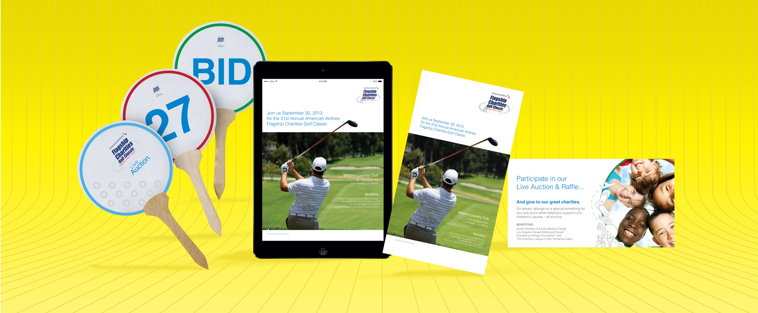
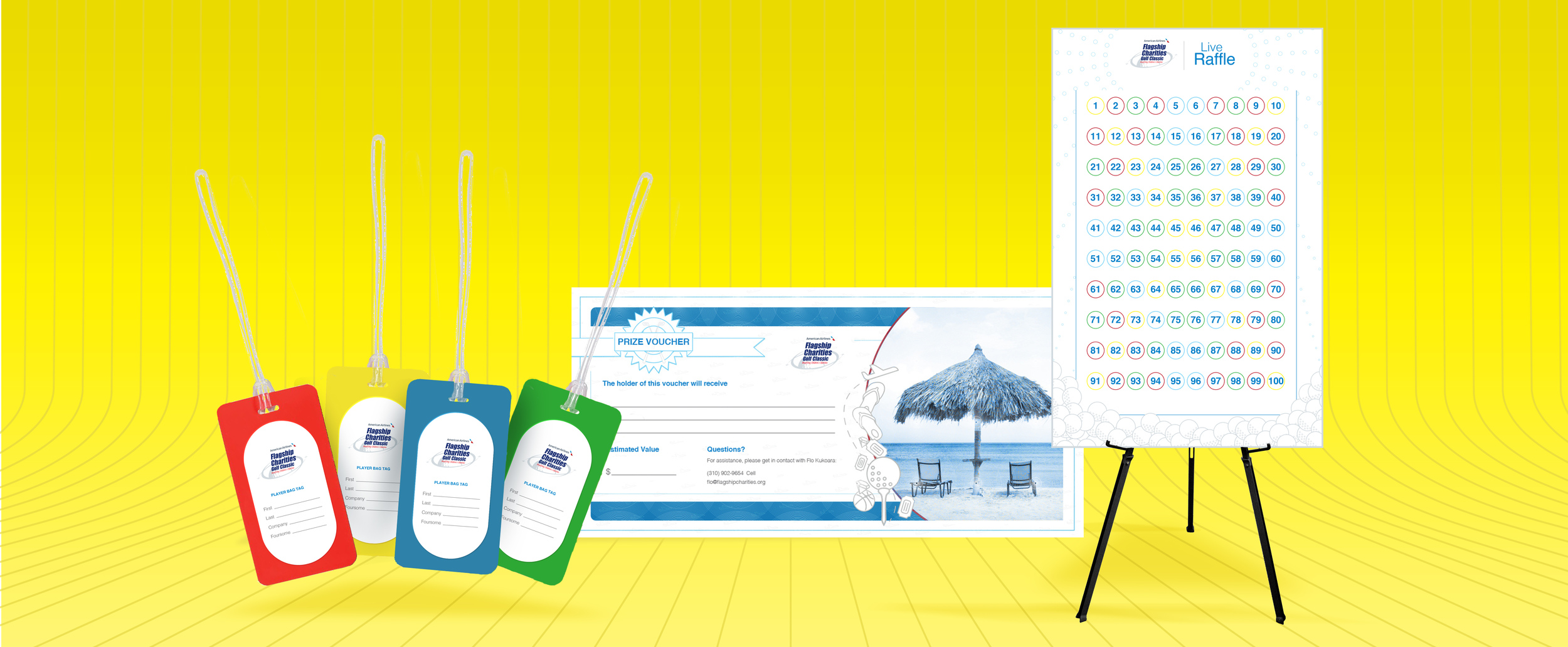
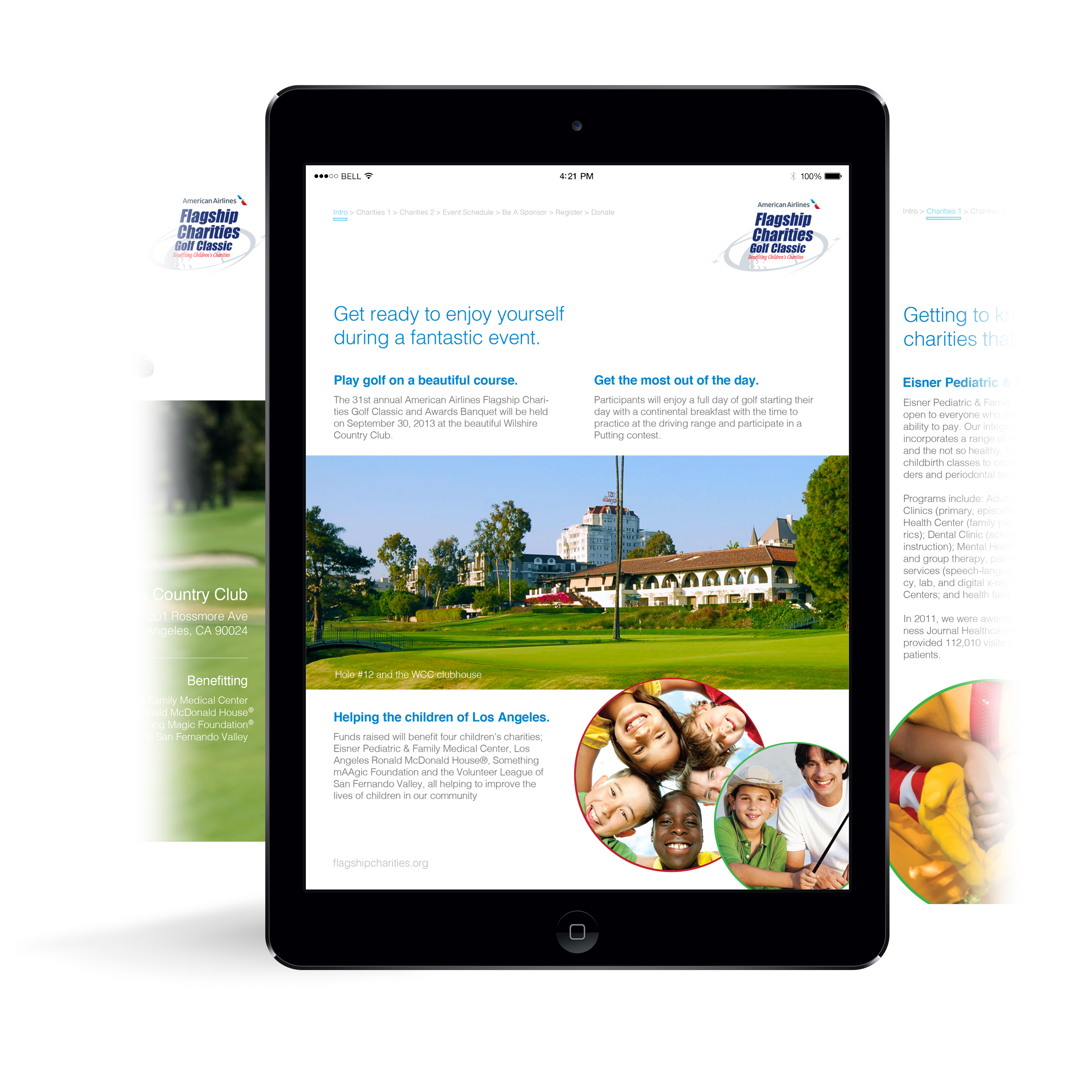
Brochure - Tablet
Title: "Flagship Charities Golf Classic"
Type: Print Campaign
Year: 2013
Software: Illustrator, InDesign and Photoshop
Design Brief: Redesign all print collateral for the American Airlines Flagship Charities Golf Classic event (2013) to include a printed/electronic brochure, all signage, bag tags, and props/certificates needed during dinner and auctions.
Concept: Observes the new branding style for American Airlines while introducing hi-res photos and iconography. The repeating circular shapes used throughout the theme along with AA's new color scheme and icons tie the layout to the current company brand image.

Title: "Open Happiness"
Type: Product Ad
Year: 2013
Software: Illustrator and Photoshop
Photography: Edmond Hon
Design Brief: Working with a student photographer, conceptualize and design all the supporting graphic elements to be used in harmony with the photography for a cold beverage advertisement in a magazine. Write a headline to go along with an existing company and its slogan.
Concept: The idea that with every twist-off of a Coca-Cola cap, comes a smile. The bottle caps represent each satisfied customer's happiness mimicking an ascension of carbonated bubbles as well as the shape of the Coca-Cola swoosh.
Open Happiness

Building A Movement
Title: "Building A Movement"
Type: Environmental Ad
Year: 2013
Software: Illustrator and InDesign
Design Brief: Select an active charitable organization and use their existing brand while advertising their cause(s) inside of a two-page magazine spread.
Concept: Use a clean layout and blocky slab-serif headline/subhead font types, and shape/align the photography to behave like building blocks that fit together in an interesting way.

W.W.Web Masters - A
W.W.Web Masters - B
Title: "W.W.Web Masters"
Type: Ad Campaign
Year: 2013
Software: Adobe Illustrator
Design Brief: Design a one-page magazine ad campaign for EveryoneOn, an existing company that strives against digital illiteracy. Use stock images and find a creative way to entice readers to learn more about the cause.
Concept: Using a comedic take on the subject matter, each ad depicts a scene that starts at the top of the page with a candid peek into a first-time internet user's attempt at using a search bar for a seemingly innocent purpose, only to be met with other suggestions (that the engine provides) which prove to be just as helpful unbeknown to the typer. Ultimately, convincing the user of the internet's usefulness – proving how-to knowledge of net to be worthwhile.

Cautionary Tail
Debbie Pattillo
El Cholo 2
Title: "Cautionary Tail"
Type: Logo
Year: 2014
Software: Adobe Illustrator
Design Brief: Freelance client with an up-and-coming music studio requested a logo design for his record label (Cautionary Tail) that would incorporate an aspect of the antique recording equipment he collects and works with, namely a VU meter.
Concept: The name of the record label is strewn across a stylized VU meter, a visual better assisted by the appearance of a red needle symbolically reading inside of the red (or cautionary) section of the meter and the mechanical accent of two screws on each side.
Title: "Debbie Pattillo"
Type: Logo
Year: 2014
Software: Adobe Illustrator
Design Brief: A colleague starting her own business in consulting (catering to companies looking to boost revenue via networking and marketing) asked for a simple logo to be used for digital letterhead.
Concept: I perceived Debbie P. to be a "go with the flow" type after working with her for nearly 11 years. This ideal was paired with the first and last initials of her name, conjoining the letterforms in a way that follow the curvature of a flowing current, set in her favorite color - purple. The shape also creates a stylized dollar sign tying into her service objective.
Title: "El Cholo 2"
Type: Logo
Year: 2013
Software: Adobe Illustrator
Design Brief: Select and redesign an existing restaurant's logo and color palette to be used on their totally redesigned web page.
Concept:
Use bright fun shades of red, green and yellow (colors most representative of food), a culturally festive font and vector imagery of chiles all laid out on a stylized sombrero to create the feeling of a "fiesta" when looking at the new logo designed for El Cholo, a Mexican restaurant in Southern California. The chiles act as a symbol for the company's new brand that can be broken away from the logo to be a stand-alone piece.